Surface
Material, coating, texture, curvature and usable branding area affect which methods are realistic.
A neutral product is only the starting surface. We match the material, shape and intended use with a viable branding route, then coordinate placement, color and packaging so the finished piece belongs to your brand.
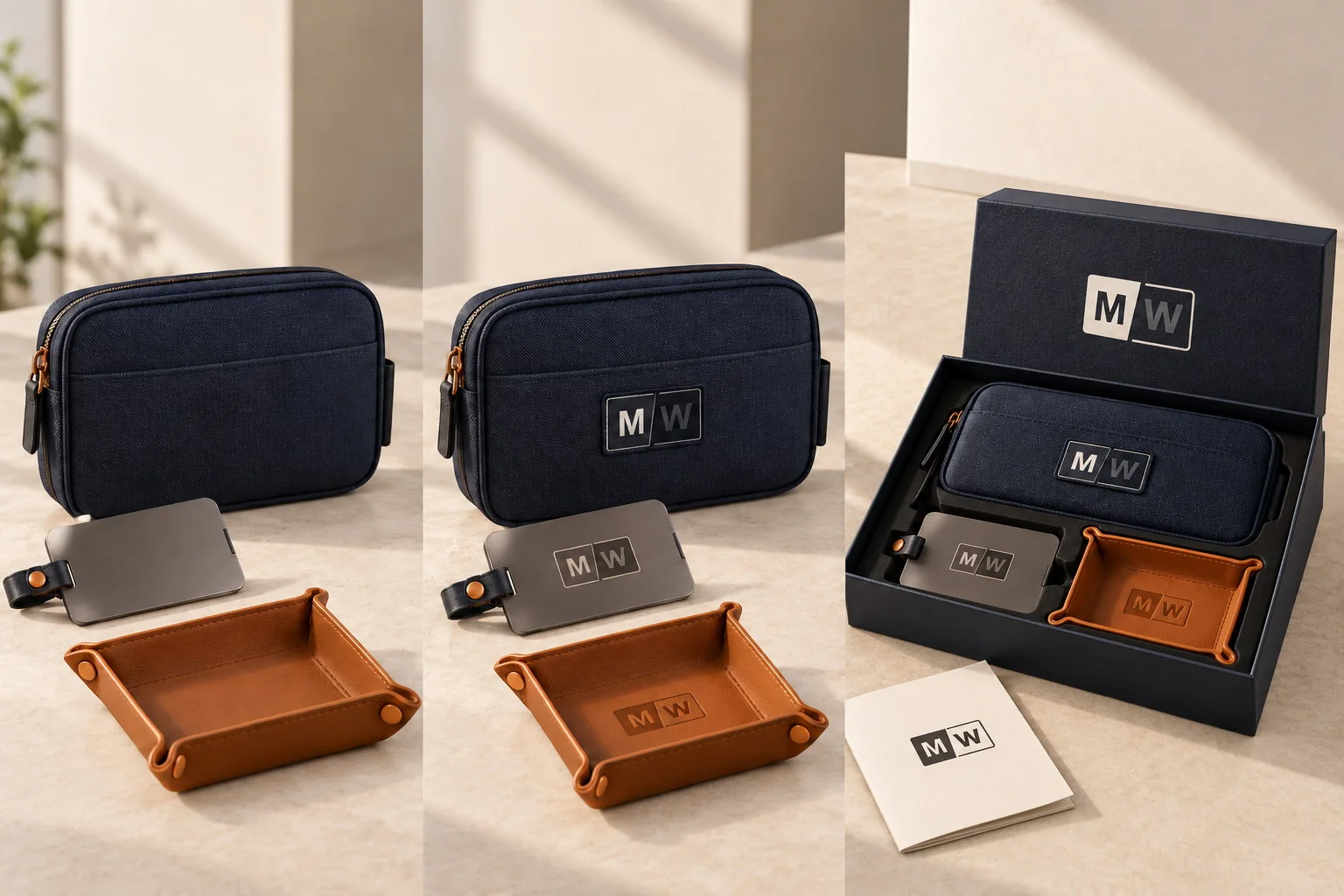
The same artwork behaves differently on woven fabric, coated metal, soft silicone, textured leather-like surfaces and printed paper. We review the surface before recommending a method, because the strongest result is one the product can carry cleanly and the project can approve with confidence.
Material, coating, texture, curvature and usable branding area affect which methods are realistic.
The audience and moment determine whether the mark should feel discreet, balanced or campaign-led.
Product branding, packaging, inserts and versioning should read as one identity even when they use different production methods.
Each material changes what the artwork can do. The methods below are practical starting families; the exact route remains subject to the selected product, supplier and approved sample.
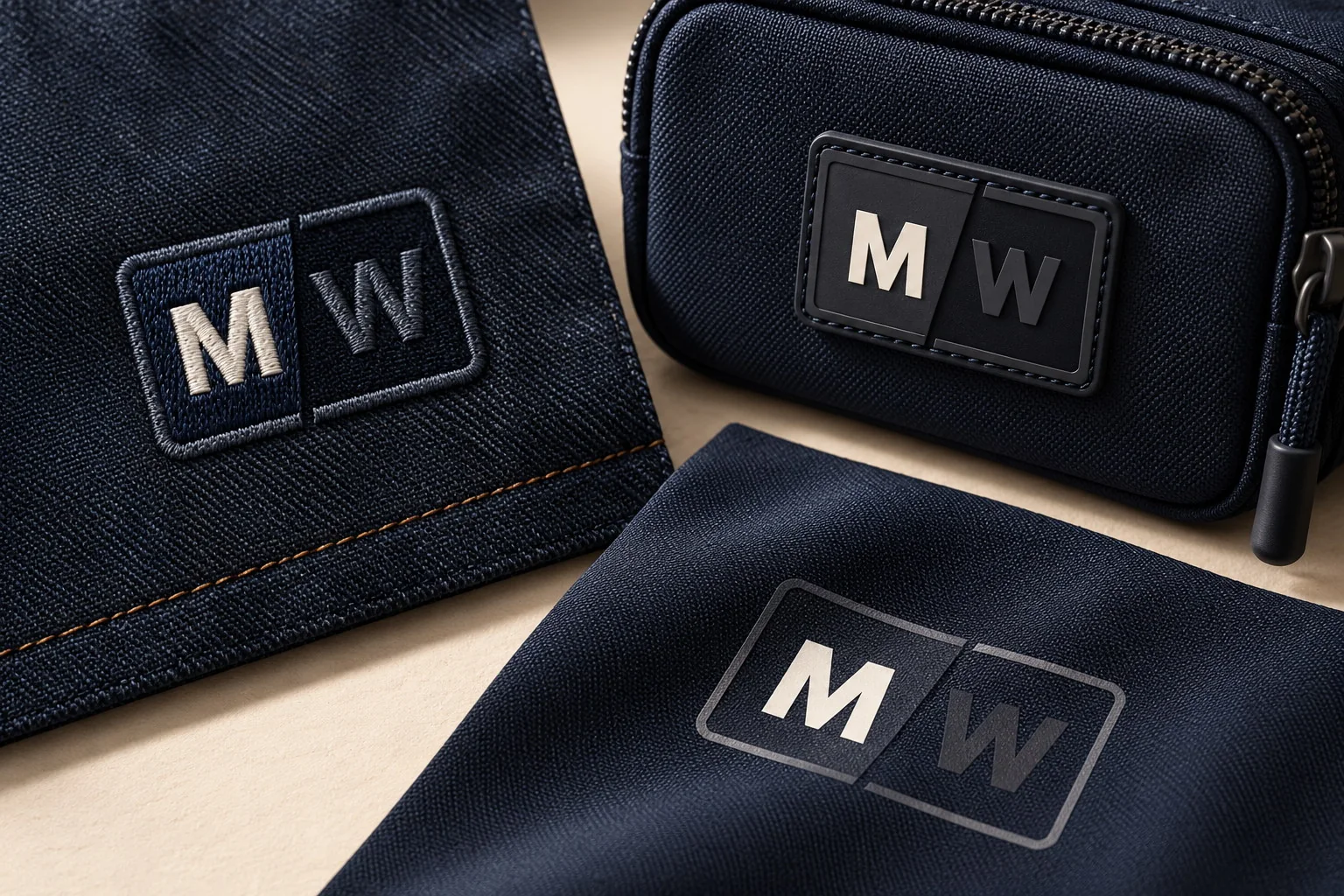
Embroidery can add texture and dimension. Woven or molded patches can make a compact mark more tactile. Screen printing and transfer methods can support flatter artwork or larger areas. The right route depends on the fabric, construction, artwork detail, placement and intended use.
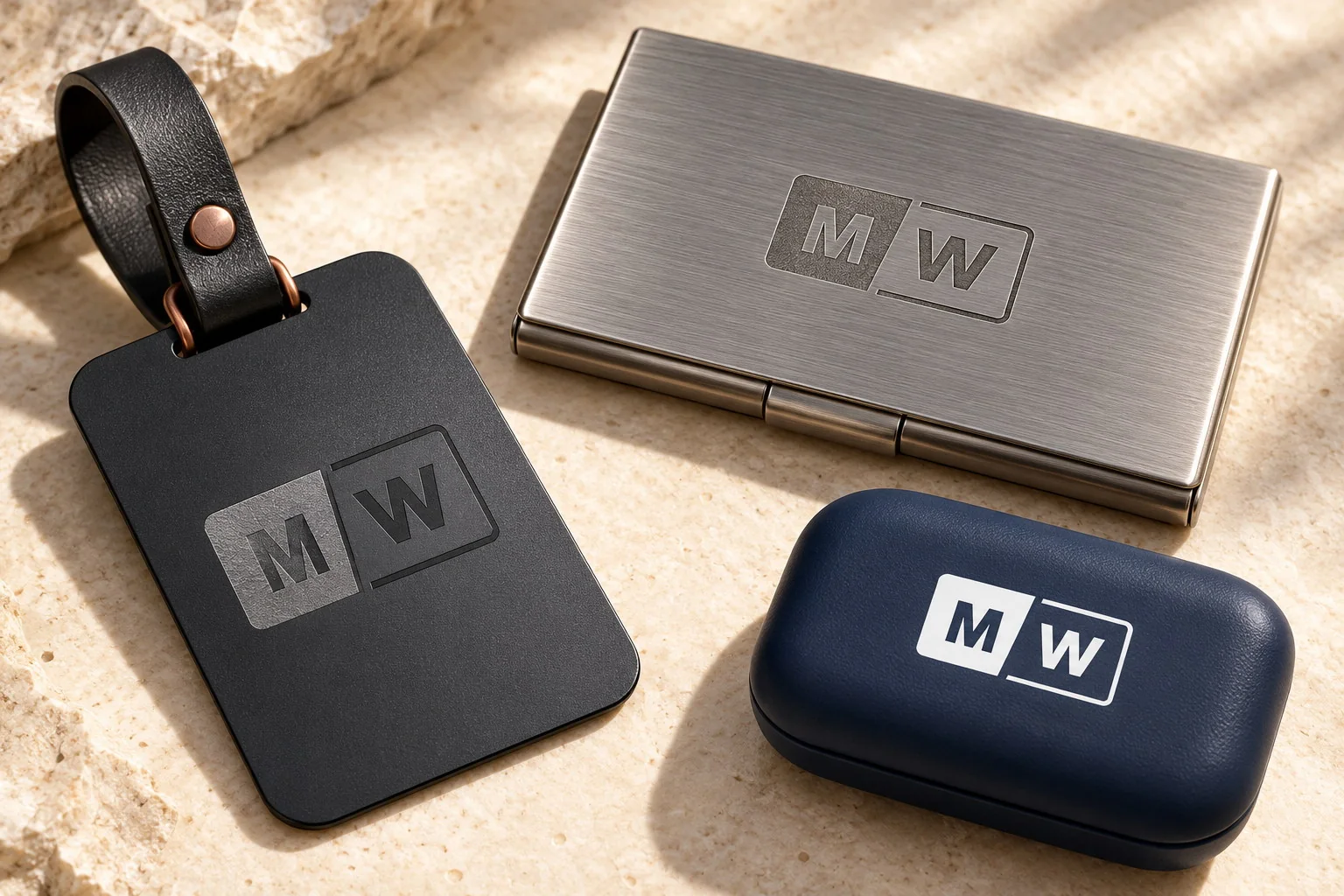
Laser marking or engraving can create a restrained result by revealing or altering the surface. Printed or color-filled options can add contrast when the coating, shape and production route support them.
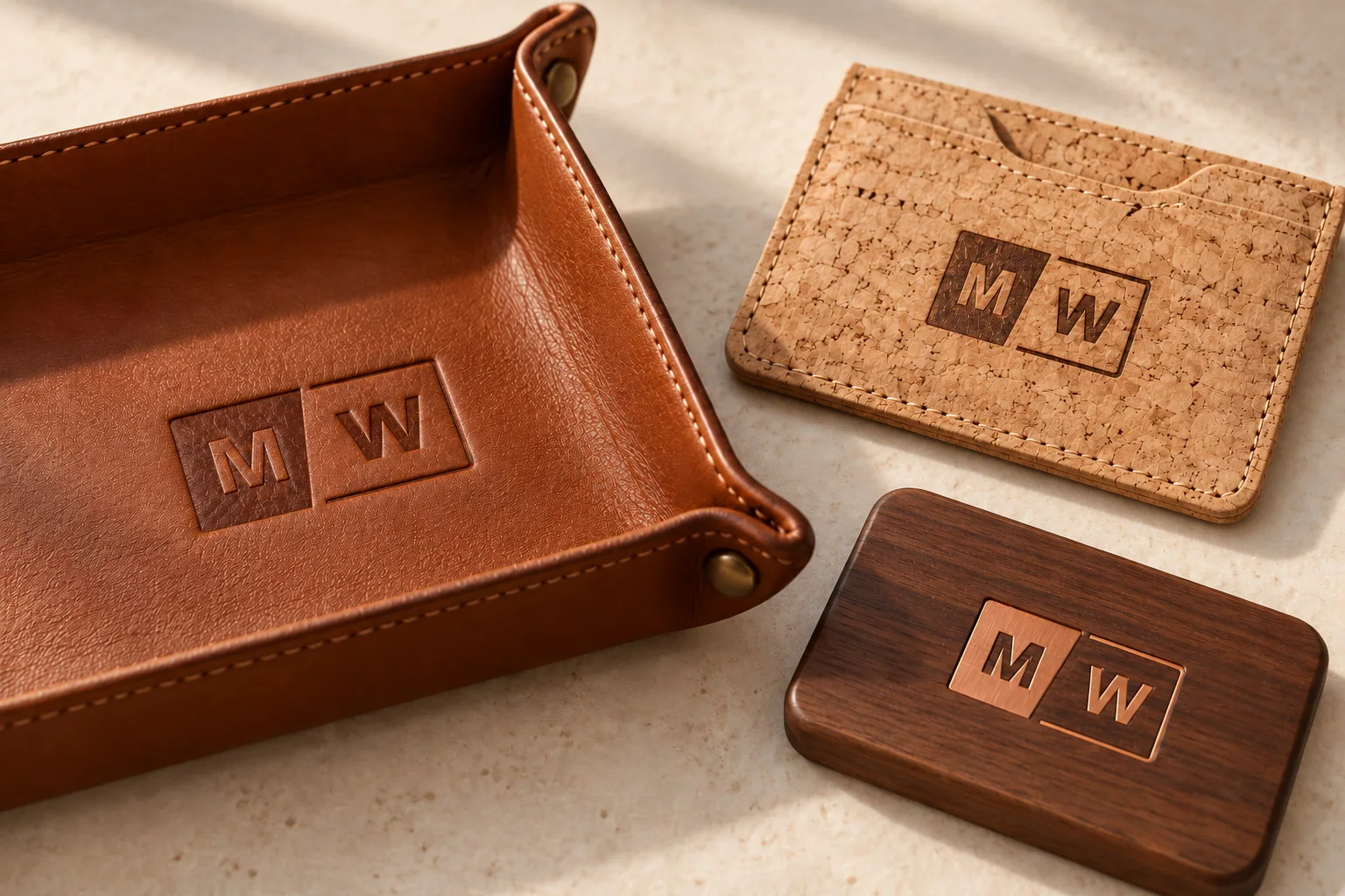
Debossing, embossing, foil and laser marking can make the identity feel integrated with a tactile surface. Logo detail and contrast need to suit the grain, thickness, color and construction of the selected item.
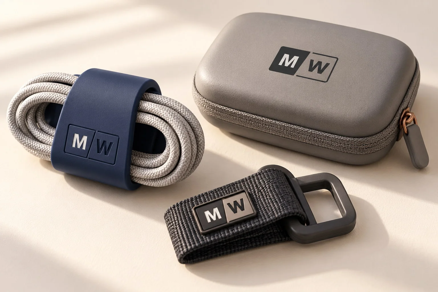
Pad printing, screen printing, UV printing and molded marks can serve different shapes and color needs. Curved, flexible or coated parts require product-specific artwork placement and feasibility review.
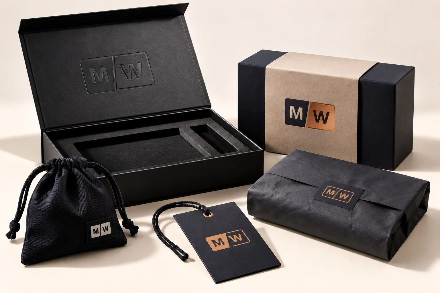
Printed color, foil, embossing, debossing, sleeves, labels and inserts can connect the outer package with what the recipient finds inside. The method should support the message, structure and opening sequence rather than decorate every available surface.
The same identity can feel quiet, balanced or campaign-led. Placement, scale and contrast change the message without changing the logo itself.
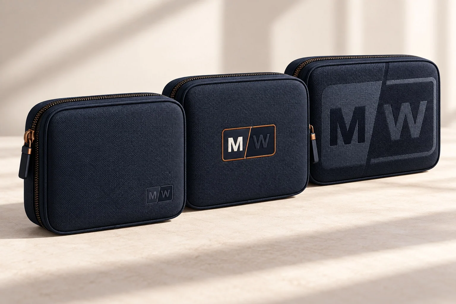
Small scale, low contrast or a discreet placement can suit executive, relationship and everyday-use programs where the object should feel natural to keep.
Placement, color and packaging share the work, giving the brand a clear presence without taking over the entire product.
Higher contrast, larger visual fields or supporting graphics can serve launches, events and activations when immediate visibility matters.
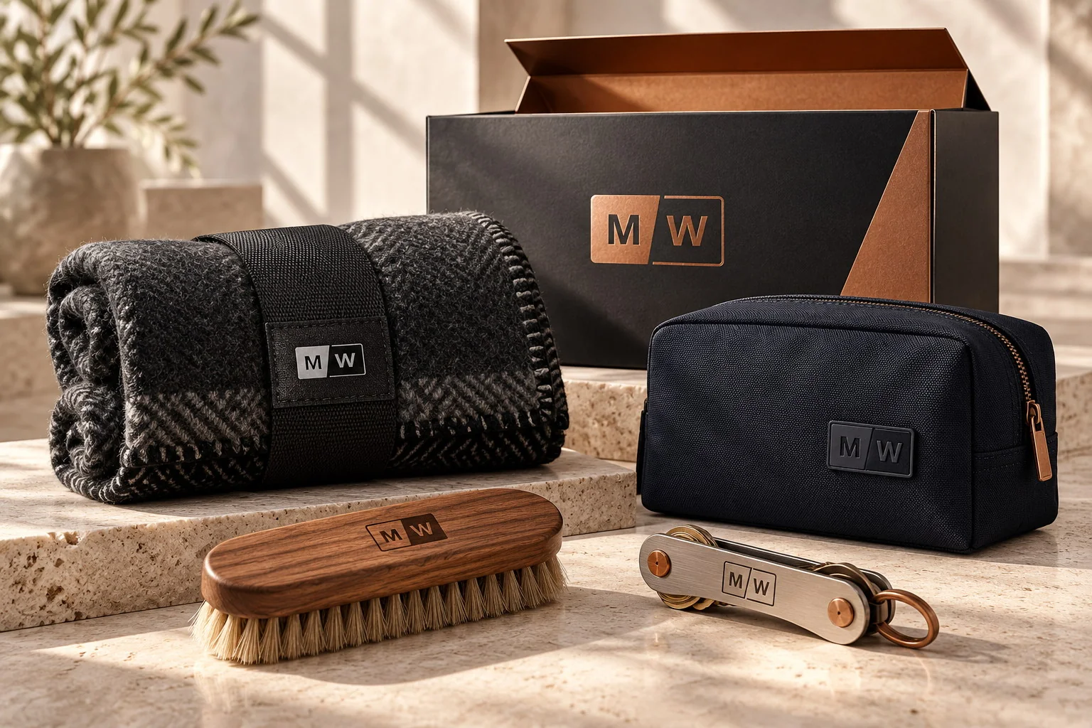
The product mark does not have to carry the entire story. Color, packaging, printed content and the order in which details appear can give the identity more room while keeping the useful objects considered and wearable.
Set position, scale, contrast and method for the object itself.
Review available finishes or material colors against the brand direction.
Coordinate the shipper, presentation box, sleeve, bag or wrap.
Connect tissue, dividers, labels, inserts or message cards.
Control recipient variants and what appears first, next and last.
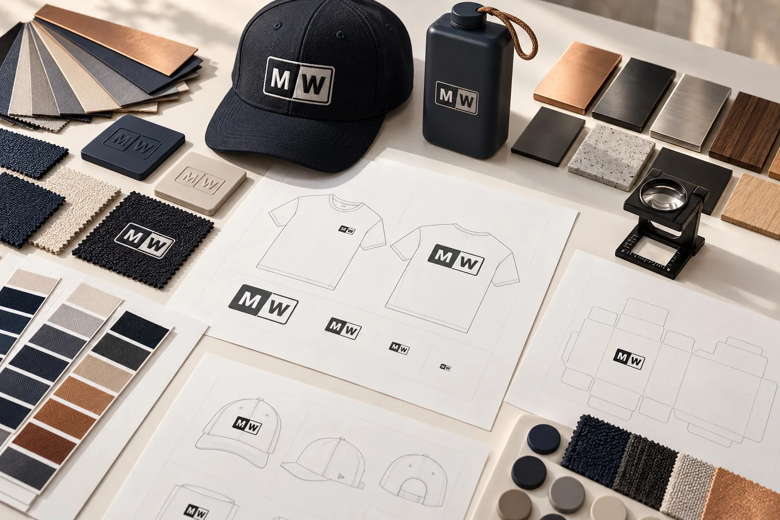
Brand application moves forward through the level of proof the product and risk require. The sequence below keeps surface, artwork and physical finish connected.
Logo files, colors, guidelines, audience, purpose and desired visibility establish the constraints.
Material, shape, construction and packaging reveal where the identity can appear.
Placement, scale, color and packaging relationships are shown against confirmed specifications.
A decorated sample may be needed when a screen cannot resolve texture, color, function or presentation.
Production proceeds after the applicable product, branding, packaging and commercial conditions are confirmed.
You can begin before every brand file is complete. The materials below help us judge what can be visualized, quoted and approved at each stage.
Vector AI, EPS, SVG or production-ready PDF files where available.
Approved color values and Pantone information when the brand uses it.
Guidelines, minimum sizes, clear space and prohibited treatments.
Who receives the merchandise, why it matters and how it will be handed over.
Quiet, balanced, campaign-led or open to a recommendation.
Preferred materials, product directions and any required exclusions.
Quantity, budget range, required date and destination model.
Packaging, inserts, recipient versions or language variations.
Missing brand assets do not prevent an initial brief, but they may limit the artwork, pricing and production approvals that can be completed. Trademark review, brand strategy and original logo design are separate responsibilities unless specifically agreed.
These answers clarify what can be decided early and what must wait for a specific product, method and approval path.
Share the audience, product direction, brand assets and practical limits. The first response will identify the surfaces, methods and approval questions that need to be resolved before the direction can move forward.